
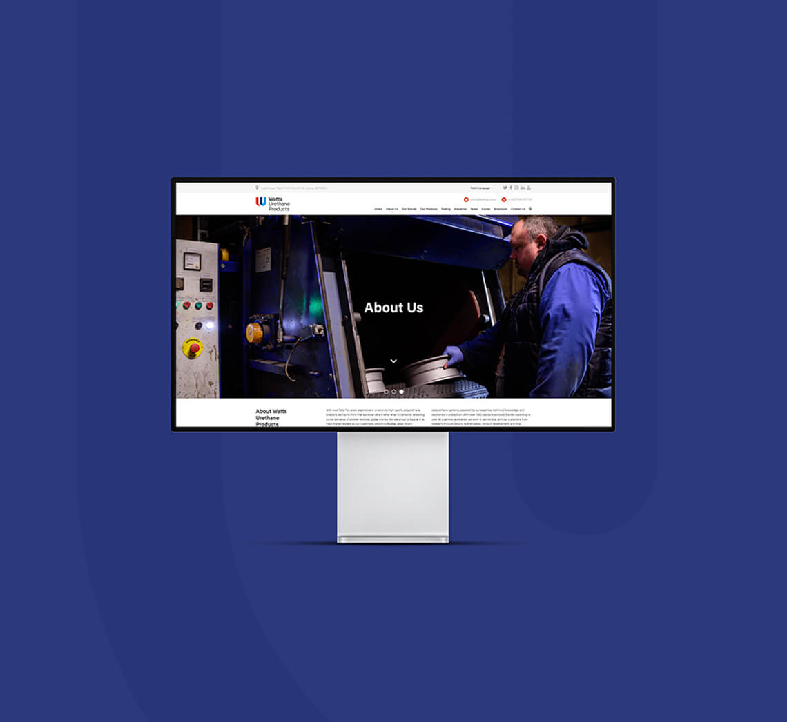
Watts Urethane has been designing, developing and manufacturing a vast range of premium polyurethane products for over 45 years.
Watts was eager for a new logo to help them promote their products worldwide and be futureproof for the years ahead. They also needed a ‘branded house’ of sub-brands to generate consistency across their product lines. Finally, they wanted to keep the existing colour palette but tweak it to better fit a global audience and promote their UK heritage.
We evolved a series of logo designs that would work for branding the product markets, as well as a stand-alone design to promote the main business. Using supplied photographic references and our five-step design process, we developed a logo style built on the business heritage, its UK provenance and its product line.
The final logo design uses a stylised W for Watts. Where the two ‘U’ shapes cross over to make a ‘W’, the dark navy shape is a profile of one of Watt’s best-selling products, a squeegee. The logo is predominantly red, white and blue, but we also use a powder-blue heritage colour. This colour was prominent in the business’s inception during the early 1970s and represents the long-living heritage of the company. We also created logos and a colour scheme for product and business divisions.

Are you seeking a logo that celebrates your past and will guide your business into tomorrow? We’re the clever choice for an affordable but meaningful logo to help lead the future of your business.

“Our logo is now not just an image, there is hidden creative meaning to all aspects. Unique and bespoke, reinforcing our approach.”
Andrew Macpherson
Watts Urethane


