 – Smart Business Branding")

Snow Elk Productions are corporate video specialists based in Derbyshire, UK.
The existing company logo design was complex, old and did not channel their business values or reflect a modern video production approach.
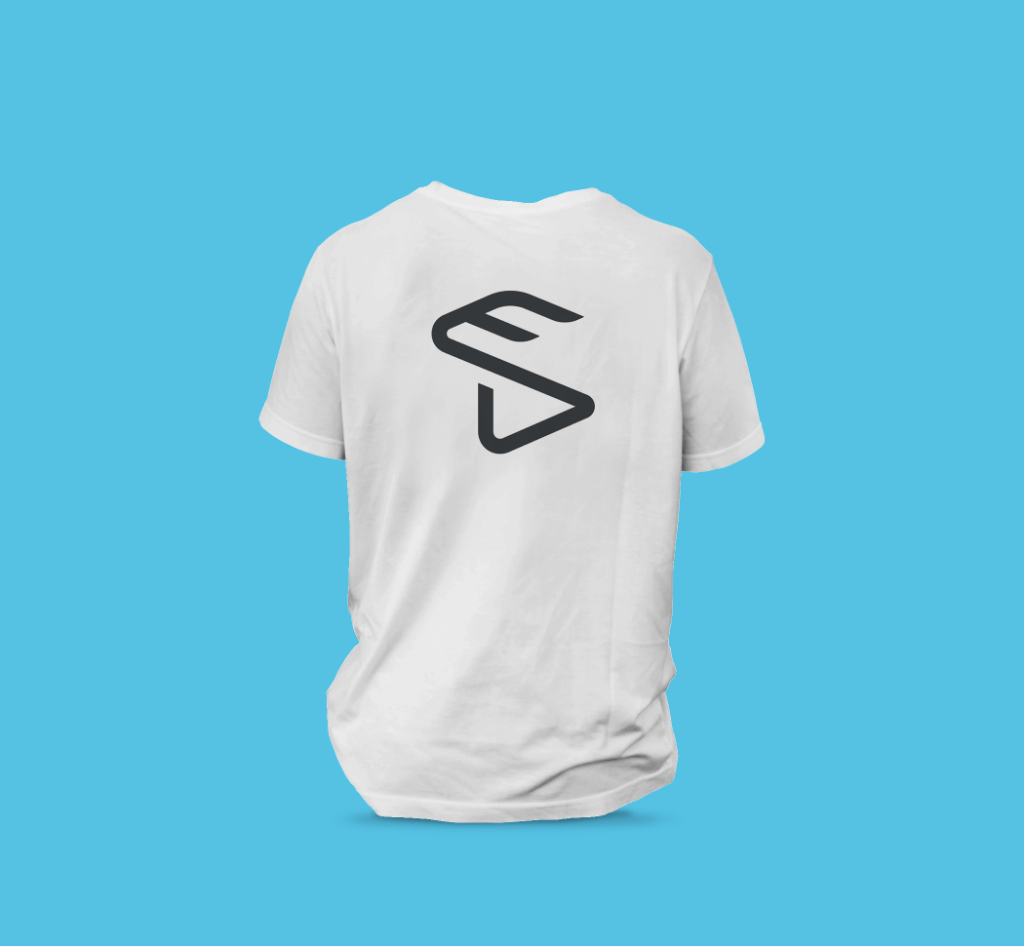
Gary Knowles, Managing Director, approached us asking for a logo with an icon that had meaning, was modern, conveyed the business values and had the simplicity of a single colour. Thanks to our existing working relationship, Gary trusted our branding & design services to deliver on his brief. We developed three icon-based logos around an Elk. Due to the existing logo being a very complex Elk illustration, it needed simplification; we did not want to lose the brand recognition, so we built on it.
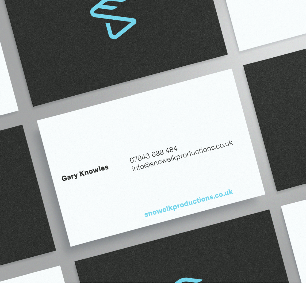
The final design is meaningful interpretation, by using a simplified profile of a Elk comprising the letters’ S’ and ‘E’ and the negative space in the head of the Elk, presenting a video’ play button’ triangle. Powder blue was the chosen brand colour for its link to ice and snow, its professional calmness and its propensity to work well on video credits.
Are you seeking a logo that looks cool but has hidden meaning? We’re the clever choice for an affordable but meaningful logo to promote the hidden values behind your business.
“There’s now a creative, hidden meaning in our logo, it’s unique and bespoke, reinforcing our own creative approach.”
Gary Knowles
Snow Elk Productions


