

Not Just Workwear are specialists in company-branded workwear and a sub-brand of Not-Just-T-Shirts, based in Chesterfield, UK.
Andy Bailey, Managing Director, approached us asking for a clean, simple logo design that is easy to apply across various marketing materials, including embroidery, apparel print, and digital platforms, as the brand is delivered via an online store. Andy was also looking for something simple but meaningful, and reflective of the business proposition – affordable, no-nonsense, high-quality workwear.
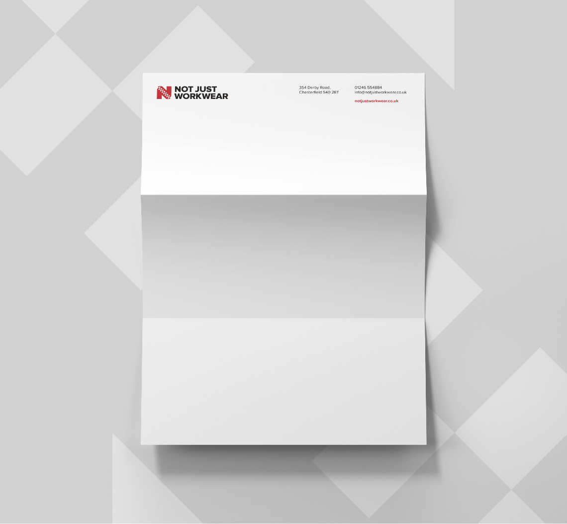
Andy completed our initial questionnaire and took the opportunity to be involved at every step of the process. We listened and took his comments on board; we built a logo design that can be adapted to fit various print substrates and broken down into smaller components for use on the web.
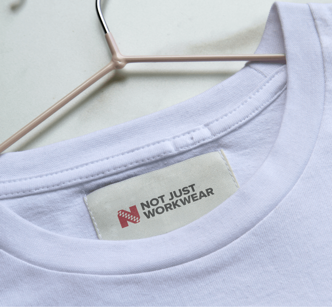
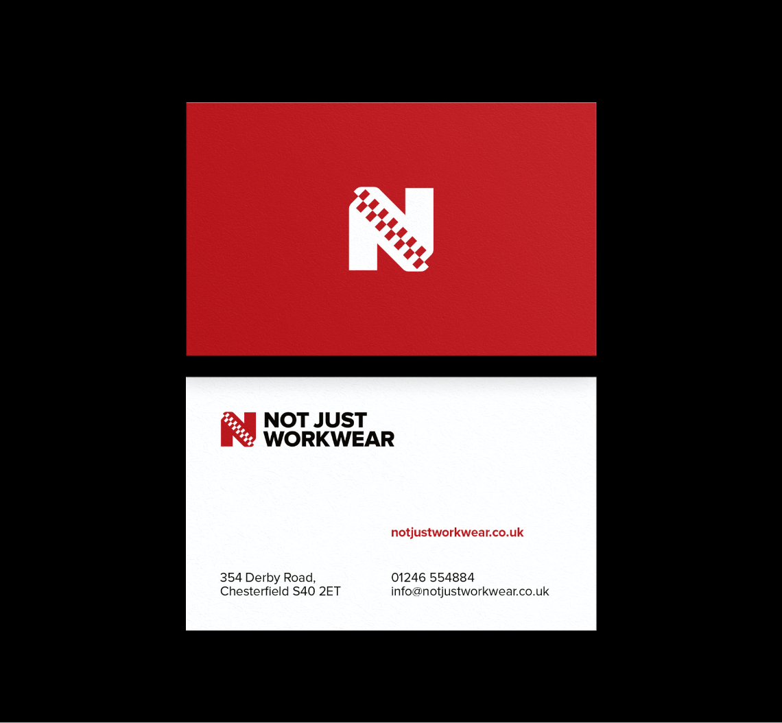
We chose a bold, active red for the final colour contrasting with a masculine bold black typeface, reflective of the brand’s audience – mostly male business owners. The logo is designed purposefully for digital, contrasting well against a white background and a perfect fit for online accessibility guidelines. The icon features a simple zip connecting across the diagonal of the N, denoting firm, strong qualities reflective of the business and its products.
Do you need a bolder logo for your digital enterprise? We’re the clever choice for an affordable but meaningful logo that’ll make your brand ‘pop’ when your customers’ shop.
“We are really impressed with the whole process and how your team listened to our needs from start to finish.”
Andy Bailey
Not Just Workwear


